Help with colors...again

I am not freshening up to sell, I'm just tired of looking at the same old same old, and I do like color, I'm just no good at coordinating them.

This morning I was looking at the Behr paint website and discovered a fun feature. You take a photo of your room and then tap on the surface you want your selected color applied to. The theory being you can get a feel for the finished look, unfortunately it kind of effects the entire picture so isn't very useful in my opinion. The effect was different depending on what paint color you select so maybe still worth checking out next time you paint.

Thanks again for all your help.
I find that too with those paint programs.. where you can upload a photo of your room and try various colours on the walls...same with carpets... but they're not true to the shades, or to any lighting in your home... etc.. so not really that helpful....
 
Patty, I'm not trying to hassle you. No one has to change their answer - not you or me.
We sold our house 3 years ago and our realtor told us to repaint our entire house over in neutral colours. The reason being that neutral colours neutralize the look of the house so potential buyers can visualize their own things in it.

It’s basically the same thing you are saying. Bright bold colours aren’t everyone’s cup of tea. Red, orange, turquoise colours may be nice colours but not on house walls. Neutral colours are SAFER.

I picked the grey because it matched the grey that was already in the room.

Note: Some rooms look fabulous in bold colours but you get more buyers with neutral ones. I realize he isn’t selling his home.

I apologize for snapping at you.
 
@C50 , actually you have very little wall space in your kitchen to even notice much in the way of color.

2 soffits and a wall space taken up by a hutch and refrigerator is not much. You won't even notice it after a week.

I'd be sure to change the hardware on the cabinets to something sleek and simple in a steel finish.

KNP_6832.jpg
 
We've recently become rather fond of the "greige" color for certain situations. I'd also go with either #1 or #6 for your walls.

Over the years, any changes to our homes were made with at least a partial eye toward their impact on resale. When we bought this house, we decided to do only what WE like whether fashionable or not. Hang resale! For instance, we currently have a lot of natural hardwood (trim and furniture), which I'm told isn't 'in" at the moment. Well tough cookies!! We like it. 🙃

Our kids can worry about selling the place when the time comes. 😂😂
 
Did you think about matching a color in your kitchen based on the decorative tile in-between the wood floor & square tiles? I think green would make it pop, #3 first choice followed by #1.
 
Did you think about matching a color in your kitchen based on the decorative tile in-between the wood floor & square tiles? I think green would make it pop, #3 first choice followed by #1.
Green was my first choice, I started off with a green a few shades lighter than the #3 green but didn't like it. Then with #3 I was worried it was too dark, the room doesn't get much natural light.
 
@C50, I painted the 10 x 10 kitchen that was in my SIL rental Pittsburg Paint Pine Whisper. It was a soft green that was "bright" but had a tinge of pine forest in it. I know that doesn't make much sense, but the color on the computer doesn't even look like it if you look at it.

The cabinets are a natural hickory with a clear finish that shows off the woodgrain, white tile back splash, med granite colored formica counter top, med-dark gray wood tile with white appliances. We installed LED lights over the sink, stove & over the washer/dryer on the other side. Those lights really brought the "daylight" in. Even with the counter top & floor being darker, the room is bright. Since the kitchen & dining room (where the window is located) is basically one, I used the Pine Whisper in there too.

3a7ba4ab1c2edb1b9daaef2e754f526c.jpg

Your kitchen looks bright enough with the white tile that you could pull it off.
 
Last edited:
You could end your pain by painting the very few walls with the same paint as on the cabinet. You probably have enough leftover to do it. If you want colour, there are stick on tiles that can go on the backsplash. Then you’d have a new pain on deciding what to use there.
 
Here's the my kitchen in its freshly painted glory.🙂 
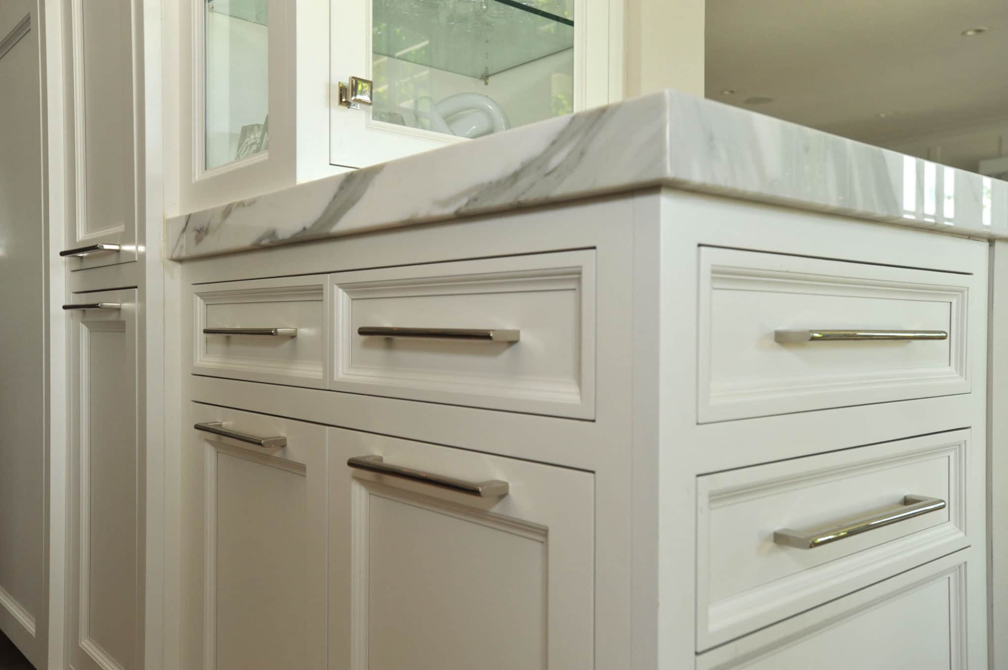
I used this view because even though it has the least amount of wall to view it best shows the combination of floor/cabinets/wall color in one shot.

Really the wall color didn't have much of an impact on the room, painting the cabinets a light color made the biggest difference. I'm happy with the way it turned out, that's all that matters.

Thanks for everyone's help and suggestions!20240301_140638.jpg
Not sure why the picture posted kind of dark, it's not like that on my phone, sorry.


Back
Top