kristinadanielyan
New Member
Hello everyone. My name is Kristina, and I'm another member of the Virginia Tech designer-engineer group that is trying to redesign car maintenance alert and warning systems. If you recall, the last thread was started by Sunny and can be found at https://www.seniorforums.com/showthread.php/2669-Are-cars-easy-to-use.
We came up with a concept that uses a screen to give the driver clear, informative feedback on the state of their car. The system is designed to work with any 'touchscreen' features that would be already in place (since the industry seems to be favoring that direction anyhow), and eliminates the confusing symbol cars currently use to communicate maintenance needs to their drivers.
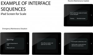
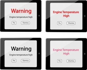
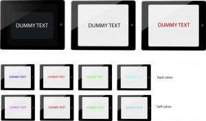
The three image files above show a rough outline of what the system could work like. If something was wrong with your car, an alert would come up and explain what's going on and what steps you can take to solve the problem. Less urgent alerts, like reminders that you need to change your oil in the next few weeks, would appear only when you turn your car on and wouldn't detract from your driving. The next two image files show a variety of dark-light contrasts and color examples.
We would love to have you feedback on the concepts and would like to know what kind of text and visuals you all would prefer. Is a dark background easier on the eyes, or does it strain them? Are harsh colors better for text, or softer, more pastel ones? Would images and diagrams be of benefit to you in instructions like 'open the hood of your car'? Thanks for your input!
We came up with a concept that uses a screen to give the driver clear, informative feedback on the state of their car. The system is designed to work with any 'touchscreen' features that would be already in place (since the industry seems to be favoring that direction anyhow), and eliminates the confusing symbol cars currently use to communicate maintenance needs to their drivers.


The three image files above show a rough outline of what the system could work like. If something was wrong with your car, an alert would come up and explain what's going on and what steps you can take to solve the problem. Less urgent alerts, like reminders that you need to change your oil in the next few weeks, would appear only when you turn your car on and wouldn't detract from your driving. The next two image files show a variety of dark-light contrasts and color examples.
We would love to have you feedback on the concepts and would like to know what kind of text and visuals you all would prefer. Is a dark background easier on the eyes, or does it strain them? Are harsh colors better for text, or softer, more pastel ones? Would images and diagrams be of benefit to you in instructions like 'open the hood of your car'? Thanks for your input!


