Hungry? So BEG!

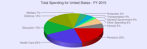
Good thing it is not 57%. You have to read a real chart and will see that military is below that spent on Health and Human Services, which is the highest spending listed on the chart.

http://www.federalbudget.com/

How this chart is created from federal inputs.

http://www.federalbudget.com/chartinfo.html

Nobody seems able to defend that chart showing 57% or who made it. Best to stick to facts from our government.
 

Bob, I think the 57% figure for military spending comes from this link https://www.nationalpriorities.org/...ited-states/?gclid=CM7IiZ6txMcCFUGXvQody74JFw and it includes all regular activities of the Department of Defense;war spending; nuclear weapons spending; international military assistance; and other Pentagon-related spending.

Are you sure that the two graphs are using the same category groupings?

Makes sense when you consider....

military_by_country_spending-by-country.jpg
 

Bob, I think the 57% figure for military spending comes from this link https://www.nationalpriorities.org/...ited-states/?gclid=CM7IiZ6txMcCFUGXvQody74JFw and it includes all regular activities of the Department of Defense;war spending; nuclear weapons spending; international military assistance; and other Pentagon-related spending.

Are you sure that the two graphs are using the same category groupings?

My point is that the charts I have posted use the US government supported numbers but so far no one has ever posted who made those other charts and what were their sources for their numbers. Numbers can be twisted by any one to make a point but for the US our best source is from the federal budget offices and their official numbers.
 
Bob, I think the 57% figure for military spending comes from this link https://www.nationalpriorities.org/...ited-states/?gclid=CM7IiZ6txMcCFUGXvQody74JFw and it includes all regular activities of the Department of Defense;war spending; nuclear weapons spending; international military assistance; and other Pentagon-related spending.

Are you sure that the two graphs are using the same category groupings?

When one considers the percentage of the budget going to Military it would only make SENSE to include the upkeep and funding of our vast network of foreign bases, as well as our nuclear program and international military assistance. to exclude them would be only telling part of the picture.. So 54-57% is very accurate..
 
I have just gone to the link you posted Warrigal. At first glance it seems they are dedicated to show how much money is wasted on military expenses by the US. I will need to read more to try to understand how their ways are so different from the US federal numbers. If they truly do use our government expenses it would be nice to know why they are different. So I keep on looking. It will take some time to understand how two source claiming to use the same numbers come up with such different outputs.
 
chart.png

links give information on the site about source information. In addition you will have to use various thinking abilities and sources to breakdown the spending as welfare means a whole lot of things, not just food stamps or providing to people are needy as one might think welfare includes tax subsidies to corporations and other types of subsidies to farmers and such.

http://www.usgovernmentspending.com/united_states_total_spending_pie_chart

http://www.usgovernmentspending.com/US_fed_spending_pie_chart

http://www.huffingtonpost.com/casey-bond/most-americans-have-income-tax_b_5030333.html
 
I like these charts that April posted. They sure look more like the ones I have posted. I would expect that no matter who makes the chart if they use the same federal stats for both.

Have not had time to do my look in to those other graphs that Warrigal gave links too.


Back
Top